
Chinese New Year is often seen as a time for renewal.
A time to pause, reflect, and begin again with clearer intention.
For us at Mantranaga, this year feels meaningful.
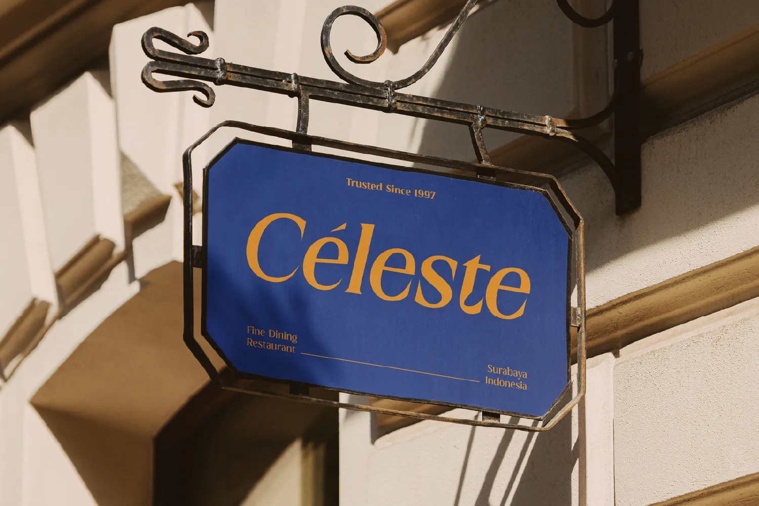
As we welcome the new year, we are introducing MN Managa Serif, a contemporary serif typeface built with clarity and confidence.

MN Managa Serif takes inspiration from classic European serif typography, particularly transitional and early modern print traditions. Rather than copying historical forms, we focused on understanding their structure and reshaping them for today’s editorial and branding needs.
The result is a modern serif typeface with:
It is designed to feel grounded, elegant, and confident across compositions.
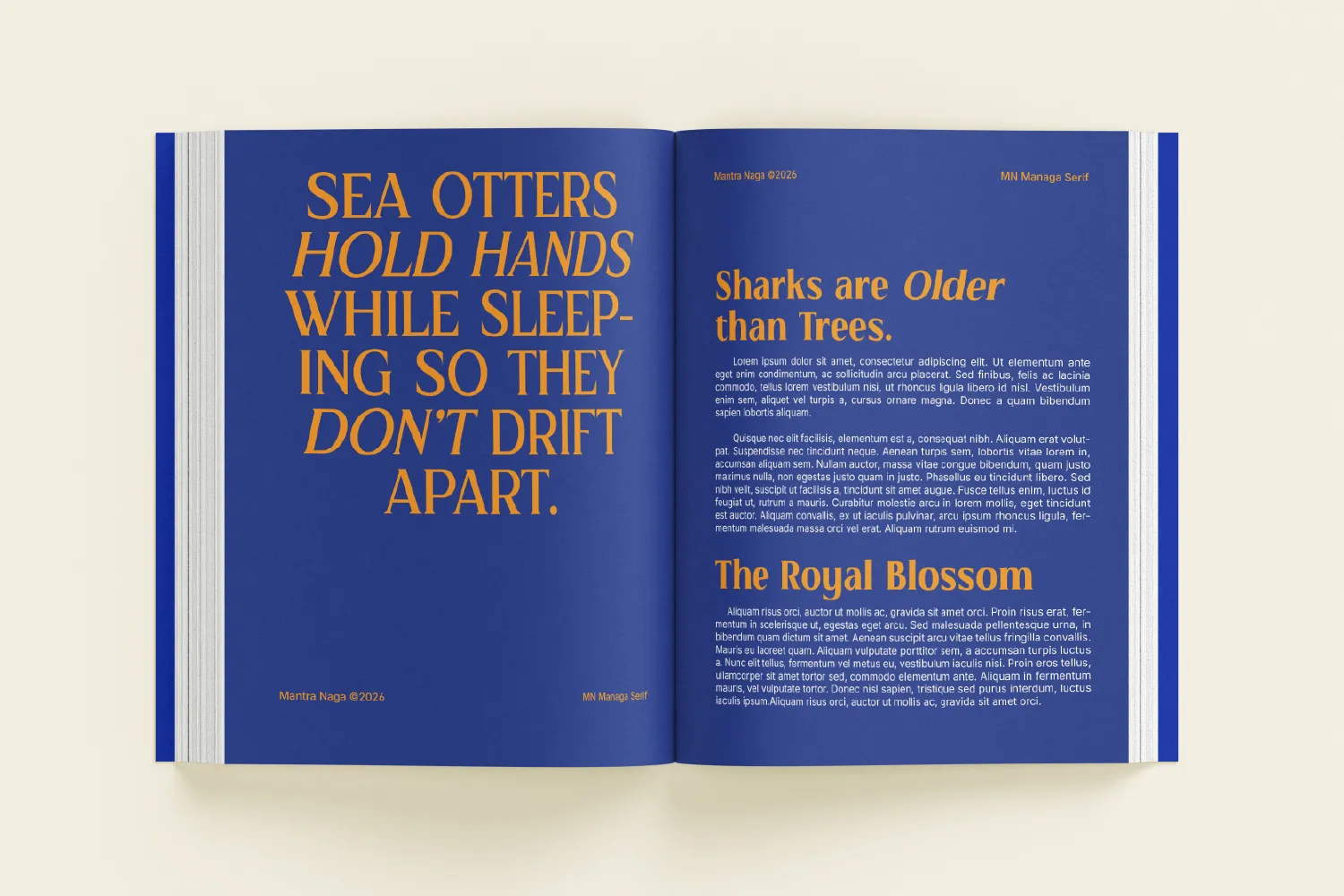
The Italic styles are not mechanically slanted versions of the Roman.
They are carefully redrawn to introduce movement and expression while preserving the identity of the typeface.
This makes MN Managa Serif versatile for layouts that require contrast, emphasis, or a softer rhythm without losing consistency.
MN Managa Serif is available in four styles:
Regular, Bold, Italic, and Bold Italic.
It works well for:
The goal was simple: to create a serif font that feels timeless, but ready for contemporary design.

Releasing this typeface during Chinese New Year feels symbolic for us.
It marks not just a new product, but a renewed commitment to building typefaces with care and intention.
We are still learning and growing.
But we are grateful to continue this journey.
Wishing you a meaningful and prosperous year ahead.
新年快乐 · Gong Xi Fa Cai!
If you would like to explore MN Managa Serif, you can view the full details here:

MN Managa Serif is a contemporary serif typeface inspired by classic European typography. It reinterprets transitional and early modern print traditions into a refined, confident voice for modern editorial design.
Built with structured proportions, balanced contrast, and precise serif detailing, this modern serif font delivers clarity, authority, and elegance across layouts. The Italic style…